Histogram
Histogram
 Sanjeev
Aug 4, 2019
3930
0
Sanjeev
Aug 4, 2019
3930
0


Histogram :It is said that Karl Pearson, who introduced the term in 1891, derived the name from "historical diagram”
Where it helps:
· Highlight the central tendency of the data
· Emphasize the variability of the data
· Determine whether a sample distribution is symmetrical or skewed

Characteristics
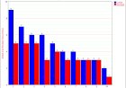
· A histogram is an accurate representation of the distribution of numerical data.
· It is an estimate of the probability distribution of a continuous variable and was first introduced by Karl Pearson.
· It differs from a bar graph, in the sense that a bar graph relates two variables, but a histogram relates only one.
· As the adjacent bins leave no gaps, the rectangles of a histogram touch each other to indicate that the original variable is continuous
· The higher that the bar is, the greater the frequency of data values in that bin.
How to construct
· To draw a histogram, Minitab divides sample values into intervals called bins. Bars represent the number of observations falling within each bin (its frequency).
· Each bar represents many observations, a histogram is most useful when you have a large amount of data.
· We can edit the number of bins and the intervals covered by each bin. Changing these settings can alter the appearance of the histogram and the conclusions you draw from it.
· The words used to describe the patterns in a histogram are: "symmetric", "skewed left" or "right", "unimodal", "bimodal" or "multimodal".


Symmetric, unimodal Skewed right Skewed left Bimodal Multimodal Symmetric
When Are Histograms Used?
· Summarize large data sets graphically
· Compare measurements to specifications
· Communicate information to the team
· Assist in decision making
What are the parts of a Histogram?
Histogram is made up of five parts:
· Title: The title briefly describes the information that is contained in the Histogram.
· Horizontal or X-Axis: The horizontal or X-axis shows you the scale of values into which the measurements fit. These measurements are generally
grouped into intervals to help you summarize large data sets. Individual data points are not displayed.
· Bars: The bars have two important characteristics—height and width. The height represents the number of times the values within an interval occurred.
The width represents the length of the interval covered by the bar. It is the same for all bars.
· Vertical or Y-Axis: The vertical or Y-axis is the scale that shows you the number of times the values within an interval occurred. The number of times is also referred to as "frequency."
· Legend: The legend provides additional information that documents where the data came from and how the measurements were gathered.
Hope this artical helps.


Comments (0)
Facebook Comments