Histogram
This article is published by Advance Innovation Group for Six Sigma practioners to help, understand and create Histogram using Minitab
 Pankaj Kumar
Apr 24, 2019
5411
0
Pankaj Kumar
Apr 24, 2019
5411
0
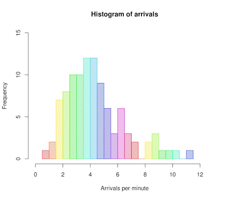

Unlike Box Plot histogram breaks data into many intervals (called Bins). These bins help you understand the frequency of distribution on every bin.
Histogram
Histograms provide a simple, graphical view of data, including its dispersion and central tendency. In addition to the ease with which they can be constructed, it provides the easiest way to evaluate the distribution of data. Unlike Box Plot it breaks data into many intervals (called Bins). These bins help you understand the frequency of distribution on every bin.
Histograms in Minitab.
Put data into column
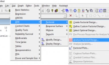
Path
Stats > Descriptive Stats > Click Data into variables > Graphs > Histogram > Click OK > Get Results.
Histogram
How to create:
Take the difference between the min and max values in your observations to get the range of observed values
Divide the range into evenly spaced intervals
– This is often trickier than it seems. Having too many intervals will exaggerate the variation; too few intervals will obscure the amount of variation.
Count the number of observations in each interval
Create bars whose heights represent the count in each interval
Sample:
Histogram 1


Comments (0)
Facebook Comments