Video on 7 QC Tools
Video on 7 QC Tools
 Pranay Kumar
Nov 7, 2022
2406
0
Pranay Kumar
Nov 7, 2022
2406
0

Video on 7 QC Tools
7 QC Tools
- Named after 7 tools of the famous warrior Benkei who owned 7 weapons which he used to win all his battles.
7 QC tools are proven scientific management tools, form the fundamental foundation for all problem solving and quality control activities.
USAGE:
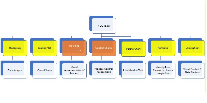
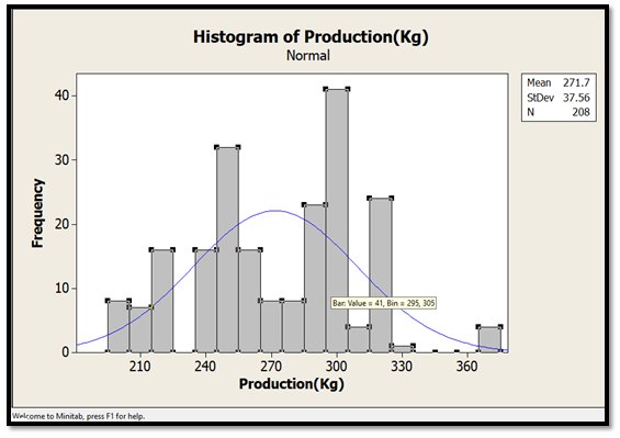
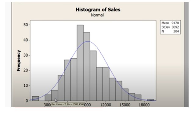
- HISTOGRAM
Usage:
Data Analysis and understanding data behavior.
- Central Tendency
- Variation
- Shape
Pictorial representation of data
- Creates bins (Data Range)
- Bin Value - Shows the Frequency of data in that bin
Variation Study (Spread or Variability or Dispersion)
Helps understand the spread of data
- Check for the bar at extreme left for lowest value
- Check for the bar at extreme right for highest value
Central Tendency
- Look at the tallest barthat you – it will showcase where you have maximum data present.
- Mode is likely to exist in the tallest bar.
- If you have two bars of same size – could mean existence of bi-modal data.
Shape
- If the data does not fit between the blue curve – it means that data is non normal
- Statistics demands root cause analysis each time your data is normal
- Involve the SMEs and identify the Root Cause
- Fix whatever needs fixing.
- Normal
- Mean +1 Std – 68%
- Mean +-2 Std Dev – 95%
- Mean +- 3 Std Dev – 99.73%
If you know the process target >> u can compare the target with performance and identify what needs improvement
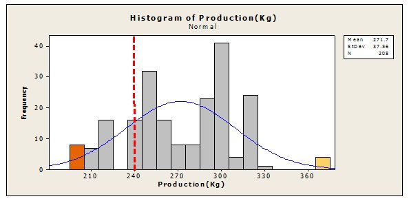
You made add targets and showcase the process performance visually.
- SCATTER PLOT
When you want to find out the cause-and-effect relationship between two variables (preferably Continuous Data) we use a Scatter Plot
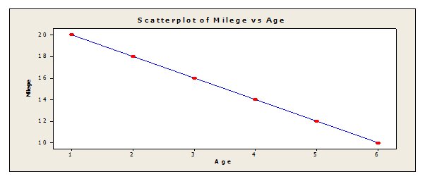
If the blue line (regression line) is moving downwards – it means, there is negative correlation between variables.
Age increase will result in lowering of Mileage
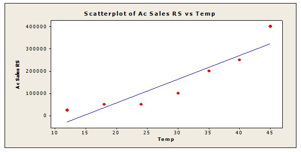
Upwards moving blue line (regression line) mean positive correlation between variables i.e. if X increases (in this case Temp) Y also increases.
|
Steepness of line will show strength of relation. Steep mean strong positive. Here blue line is less steep hence we can say weak positive relation |
Black – Strong positive correlation
Blue – Mild Positive Correlation
Red Line – No relation
Upward Moving line – Positive Correlation
Downward moving line – Negative Correlation
Straight line parallel to X Axis – No relationship
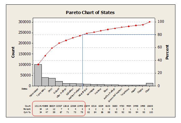
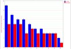
- PARETO CHART
Viferdo Pareto – While studying the economy of Italy, we concluded that 20% people own 80% of wealth of Italy.
This laid the foundation of the 80:20– Few reasons cause most problems, Vital few from trivial many
Pareto is a prioritization tool– helps us focus on issues with largest contributions
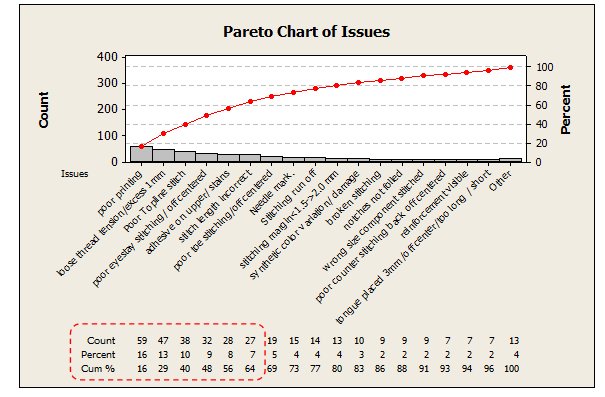
U can use the Pareto Chart to give you the focus area for problem.
Count – Occurrence count
Percentage – Overall % contribution of the issue
Cumulative –
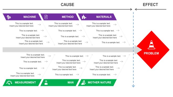
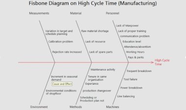
- FISHBONE DIAGRAM
Also referred Cause & Effect Diagram, Ishikawa Diagram
One of the most important methods of improvements shall always be attending to the root cause of the problem.
Fishbone – visual representation of the root causes of the problem at hand.
- Help conduct the root cause analysis
- Pictorially showcase the identified root cause
- CHECK SHEET
Possibly is one of simplest and oldest method of process control.
- Visual Control
- Create some easy to reference document to enable people with quick reference
- Do’s & Don’t List
- Forgetfulness
- Cheat sheets –for additional information
- Prior to release or dispatch
- Data Capture tool – which can establish standards
- Rosters to capture attendance or time
- Check sheets to capture activities being done
- Quality checks have checklists enabled
- Survey
Why need standards:
- Verify our system
- Assure Quality
- Assure Safety
- Enhance productivity
- Common Understanding
- CONTROL CHARTS
Control charts are also known as Shewhart chart (Dr. Walter A Shewhart) or process behaviour chart. In SPC, tools are used to determine if in a manufacturing or business process is in state of statistical control or not.
Control chart is just a run chart which includes statistically generated upper and lower control limits.
For variable data, control charts prepared and analyzed in pairs – One chart for measuring variability between groups (average or location chart) another for measuring variability within group (variation or dispersion chart)
For attribute data, the control charts track the counts a number of defectives or defects.
USAGE OF CONTROL CHART:
It provides a graphical statement whether a process has been operating in a state of statistical control and to signal the presence of special cause of variation so the corrective action can be taken.
Business processes are constantly building control chart to graphical measure and analyze their business process performance.
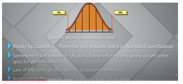
Specification limits:
Control Limits:
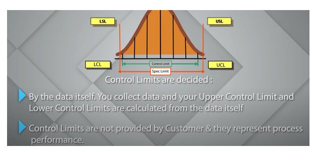
Control charts are based on UCL and LCL. – to know whether the control limits are meeting the customer requirements or not.
USL/LSL are not inbuilt capability of control charts. We can artificially introduce it.
COMMON CUASE & SPECIAL CAUSE VARIATIONS:
Any variation in the business process which lies within the UCL-LCL is known as common cause variation and any data point going outside the UCL and LCL is considered as Special cause variation or assignable cause variation.SME of business process needs to do RCA to find that cause of special cause variation and corrective action must be implemented. If it is not controlled then the process can shift towards where the special cause variation.
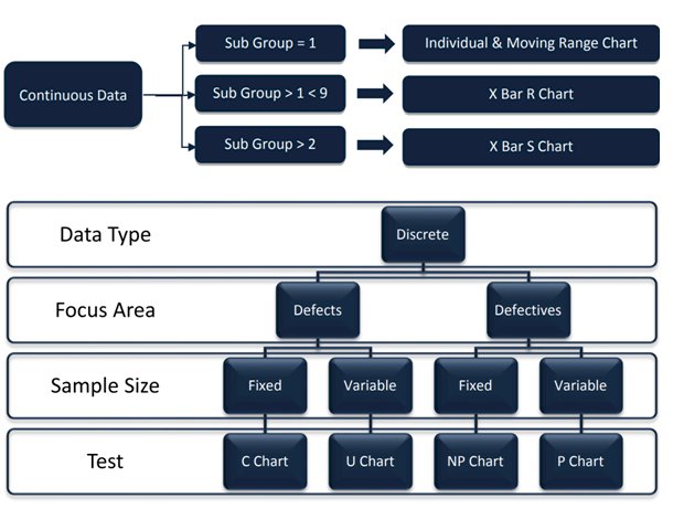
DECISION TREE OF CONTROL CHART:
- FLOW CHART:


Comments (0)
Facebook Comments