Box Plot
Box plot are typically provided as output from statistical packages such as Minitab (you will rarely construct one by hand)
 Pankaj Kumar
Apr 24, 2019
4485
0
Pankaj Kumar
Apr 24, 2019
4485
0

Box plots are typically provided as output from statistical packages such as Minitab (you will rarely construct one by hand)
Box plots
Highlights:
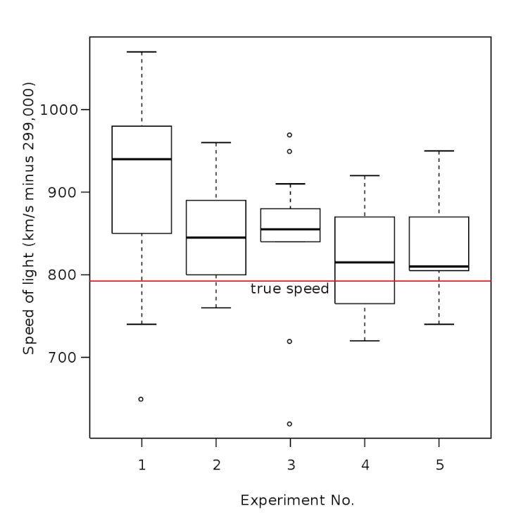
Box plots, or box-and-whisker diagrams, give a quick look at the distribution of a set of data
They provide and instant picture of variation and some insight into strategies for finding what caused the variation
They allow easy comparison of multiple data sets
To use box plots…
Box plots are typically provided as output from statistical packages such as Minitab (you will rarely construct one by hand)
The “box” shows the range of data values comprising 50% of the data set (the 2nd and 3rd quartiles)
– The line that divides the box shows the median
Single-line “whiskers” extend below and above the box (or the left and right, if the box is horizontal) showing the width of the 1st and 4th quartiles, and lowest and highest values
Data values that fall far from data values in the set are plotted separately and labelled as outliers
Outliers are data points that belong to entirely different population. These are data points that are found above Q3+1.5 IQR or Q1-1.5 IQR
Box plot – Sample
Box- Plot
Box plot will help you analyze variation in various quartiles. It helps you find quartile which is not meeting customer’s need so that you can plan to improve performance of that quartile population. This graphical tool that helps you identify outliers in your distribution.


Comments (0)
Facebook Comments