Data Representation with Various Types of Histograms
Data Representation with Various Types of Histograms
 Shishu Pal
Apr 24, 2019
10304
0
Shishu Pal
Apr 24, 2019
10304
0

Data Representation with Various Types of Histograms
Histograms are the most common form of graphically representing data distribution of continuous values. They are used to show the spread & variation in a data. This is because histograms are considered to be the best tool:
• To show distribution of data
• To match the output of the process with the expectations
• To communicate the distribution of data easily to others
Data Representation with Various Types of Histograms
Normal Distribution: This is the best shape for a given data as data is evenly distributed on both sides of Mean. Data forms a bell shaped curve (as shown in the Empirical rule). This is the ideal state for a process to be present in but unfortunately, it is very seldom found.
1
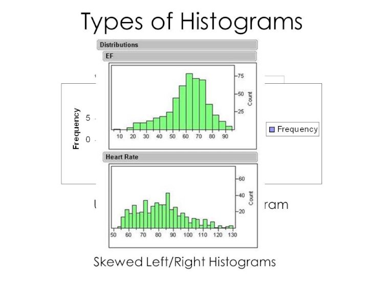
Skewed Distribution:
In this distribution, peak of the data is on one side with tail stretching away from it. Skewness in data does not mean that the data is not correct or process is behaving erratically, such as, Quality data as good quality data will obviously be biased towards higher percentages. The histogram can be both left skewed or right skewed showing the place where majority of the data points are present.
2
Bimodal Distribution:
This distribution is also known as Double-Peaked data (like a double humped camel). In this distribution, there are two peaks of data which shows the erratic performance of a process. It shows the wide variation in the performance of a process. But sometimes, data is also wrongly represented such as data of two shifts or two processes or two locations – such kind of data should be analyzed keeping in mind these conditions.
3
Multimodal Histograms:
These histograms have more than two peaks which show the very high variation and inconsistent behavior of the process. Sometimes, it may also happen that data of multiple processes, multiple locations or multiple shifts are presented together which makes data analysis very complicated.
4
Comb Distribution:
This distribution looks like a hair comb with consistent highs & lows occurring at regular intervals. There are multiple peaks occurring in the process displaying the high variation in the process. Making forecasts and predictions in such process is very difficult due to the very irregular occurring of data points.
5
Truncated Distribution:
This distribution looks like a normal distribution but without any tails of data. This may happen with normal data adjusted to fit within the specification limits and removing data that is out of specifications. This gives the impression of a truncated histogram with only data points that are occurring within specification limits being displayed.
6
A Normal Histogram with both Upper Specification Limit and Lower Specification Limit
7
A Truncated Histogram where data points within USL & LSL only being shown
Plateau Distribution:
This distribution has many peaks that show the consistent behavior of a process. It shows that the process behaves normally all the time with no single or double peaks visible in it. Such kind of conditions is generally seen in manufacturing industries where lot of machine action is involved.
8


Comments (0)
Facebook Comments