C Control Chart
C Control Chart
 Pankaj Kumar
Apr 24, 2019
2537
0
Pankaj Kumar
Apr 24, 2019
2537
0

C Control Chart
Control Charts are primarily used to check the stability of the process. C Chart is a part of Control Charts which are used in Six Sigma projects as part of Statistical Process Control. It is designed specifically for Attributed data whose sample size is constant. It works on Poisson distribution of data and works by plotting the occurrence of a condition over number of times.
In C Chart, same type defects are generally found. It also requires availability of large samples if there is possibility of finding few defects in the process.
Navigation in Minitab: Stat – Control Charts – Attributes Charts – C
c1
Select Defects (kg) from the available data fields and click “Ok”
c2
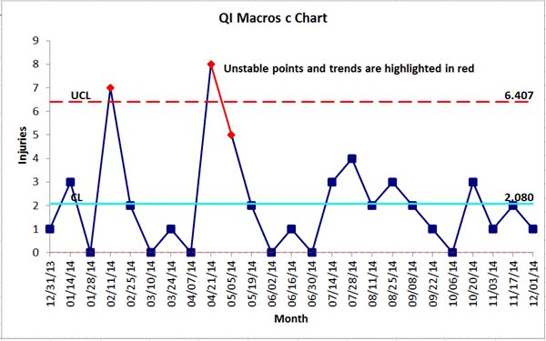
The following picture of C Control Chart is displayed by Minitab
c3
The various data points are plotted on the Control Chart, with the red dots showing the data points which have breached the control limits on both upper and lower side. These data points are also called as Special Cause Variation.
In the middle, Mean Value or C Bar as it is known of the available data is plotted and the Upper Control Limit and Lower Control limit are calculated as per the given criteria:
UCL = C Bar + 3 √C Bar
LCL = C Bar – 3 √C Bar
In the session window of Minitab, following result is shown:
Test Results for C Chart of Defects (Kg)
TEST 1. One point more than 3.00 standard deviations from center line.
Test Failed at points: 1, 3, 13, 15, 23, 27, 28, 29, 30, 32, 42, 44, 52, 53,
55, 65, 67, 75, 79, 80, 81, 82, 84, 94, 96, 104, 105,
107, 117, 119, 127, 131, 132, 133, 134, 136, 146, 148,
156, 157, 159, 169, 171, 179, 183, 184, 185, 186, 188,
198, 200, 208
By default, the first step is selected which shows the data points which have breached the upper limits and lower limits and are shown in red color. The same is mentioned in the session window (as shown above)


Comments (0)
Facebook Comments